Not a Line
By Ell Davis & Liam Ze'ev O'Connor
In 2018, Liam Ze'ev O'Connor presented these drawings in "not a line a shadow" at H Space in Cleveland. In that show, Liam presented graphite drawings, folded paper sculptures, and textiles, which examine the architectures of two highly militarized and contentious border zones: the US-Mexico Border, and the Israel-Palestine Border.
Ell Davis returns to these drawings for a conversation with Liam about how this work functions differently in the context of 2020.
#27
Ell: As I’m looking through these drawings, I have the feeling of being geographically disoriented. I’m disturbed by one particular aspect of my response, which is that the towers + gates are the most orienting or distinguishing features. My eyes immediately go there. Where did you start with this project?
Liam: I spend so much of my time thinking about the idea of “diaspora” and how it affects my relationship to the United States and to Israel as a Jew in America. Which politicians invoke Jews, and to what ends? I can tell you, I don’t think American politicians pander to Jews because they support the safety of Jewish people, but because they see Israel as a military resource. They twist the parameters of antisemitism to include legitimate criticism of Israel, instead of, you know, a cycle of oppression that has very little to do with Israel and everything to do with white supremacy... And some of them, they see the systems of separation and control at play in Israel and think “let’s get that set up over here!” Suffice it to say, I have complicated feelings about both countries.
My original idea was to take these two border zones Israel/Palestine and USA/Mexico and try to render them both as pencil drawings. As different as they are, those spaces look quite similar in terms of the type of landscape and the type of architecture used to mark them as borders, you know? So much of the landscape of California (where I am from) could pass for Israel.
I wanted to use the same drawing style I used in another project (large-scale drawings of sites Israel has named weapons after). To me it’s a loose and atmospheric type of mark-making, almost kind of impressionist, but I’ve been told it has a “rough and ready” quality to it. I think by rendering everything in graphite gray, it helps to further compress and collapse the difference.
Right. I remember you talking once about border structures— I think you said that actually a lot of the same technology was / is being used across both places?
Yeah, so the short version is to say, the U.S. and Israel have a long history of military aid, basically as long as Israel has existed as a nation. And as I understand it, Israel is the only country that doesn’t have to spend that aid with U.S. contractors. So they spend 25% of all this military aid within their own private industry, which leads to all these Israeli firms creating technologies of surveillance and control using U.S. money. The biggest one I know of is called Elbit systems, based in Haifa. And on top of that, Elbit then gets contracts with the U.S. to make helicopters and drones for the U.S. military. I don’t know that I know enough about the finances to know how ethical that is considered… but it does make me curious. And I know that they have some major contracts with the U.S. for projects in Arizona along the border building all these high-tech observation towers.
Right, it’s like ... architectural tech. I’m thinking about it that way because it is both architecture and weapon. Historically, buildings have definitely been some of the most sinister weapons, but I guess I find myself saying tech because at least when I think “architecture,” I forget how much it can do.
Yes! Like you said, they really are exercises in architecture as technology… Sure, there’s the WALL, big metal or concrete barriers built to cut through different landscapes, and those certainly have a big visual impact in how people think about the border. But more so it’s these observation towers I mentioned. So the “wall” that Trump wants to build is all bluster really, because we already have an invisible wall that is even more sinister… It's like some technology out of a Mission Impossible movie. All these towers they’re building, they have HD cameras, night vision, thermal sensors, radar, facial recognition, etc. On top of all the “real-time” data they have the capability to store and archive the data, so they can track people's movements over time….
Do any specific drawings feel central to the piece now? (Or, a series? Or do they operate in mass?)
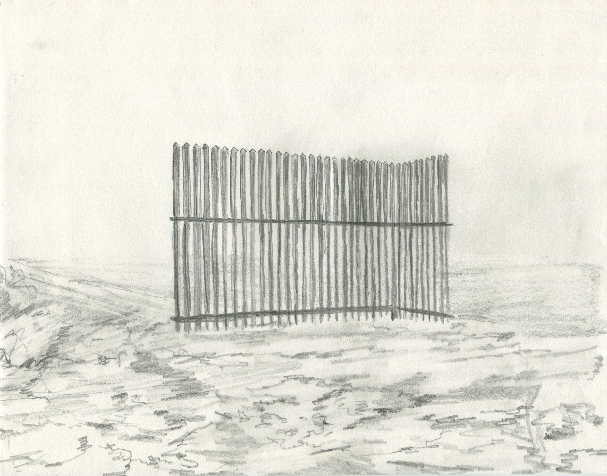
You know, there are a few that feel like my favorites, more so I think I’m really proud of them as individual drawings, 17 is definitely one (that’s of a barrier being erected in Palestine) or 27 (a sample wall built early in trump's presidency when all those defense contractors were competing to get the job). 27 would definitely be like the “album cover” of the series to me. I think partially because the drawing is so centered, with the fence right smack in the middle of the frame.
With 31, I’m happy with how I rendered the landscape with loose and abstract mark-making.
And the subject matter is so strange: a tunnel on Highway 60, which is a fully separate highway bypass tunnel for Israelis. They literally built it over and under Palestinian territory with overpasses and tunnels. It connects Jerusalem to the Gush Etzion settlement bloc south of the city, and does so by going underneath the Palestinian city of Bethlehem.
Clockwise from top left: #17, #27, #31, #9, #14, #46 (Click to Enlarge)
17 stands out to me- the long shadows, aerial view. It’s so different from say 9 or 14, which also portray the scale & height of the structure but from the ground. The light in 17 is palpably forceful.
Maybe it’s obvious but I’m also curious about the figures and cars that are moving through here - who they are - who you wanted to portray and why?
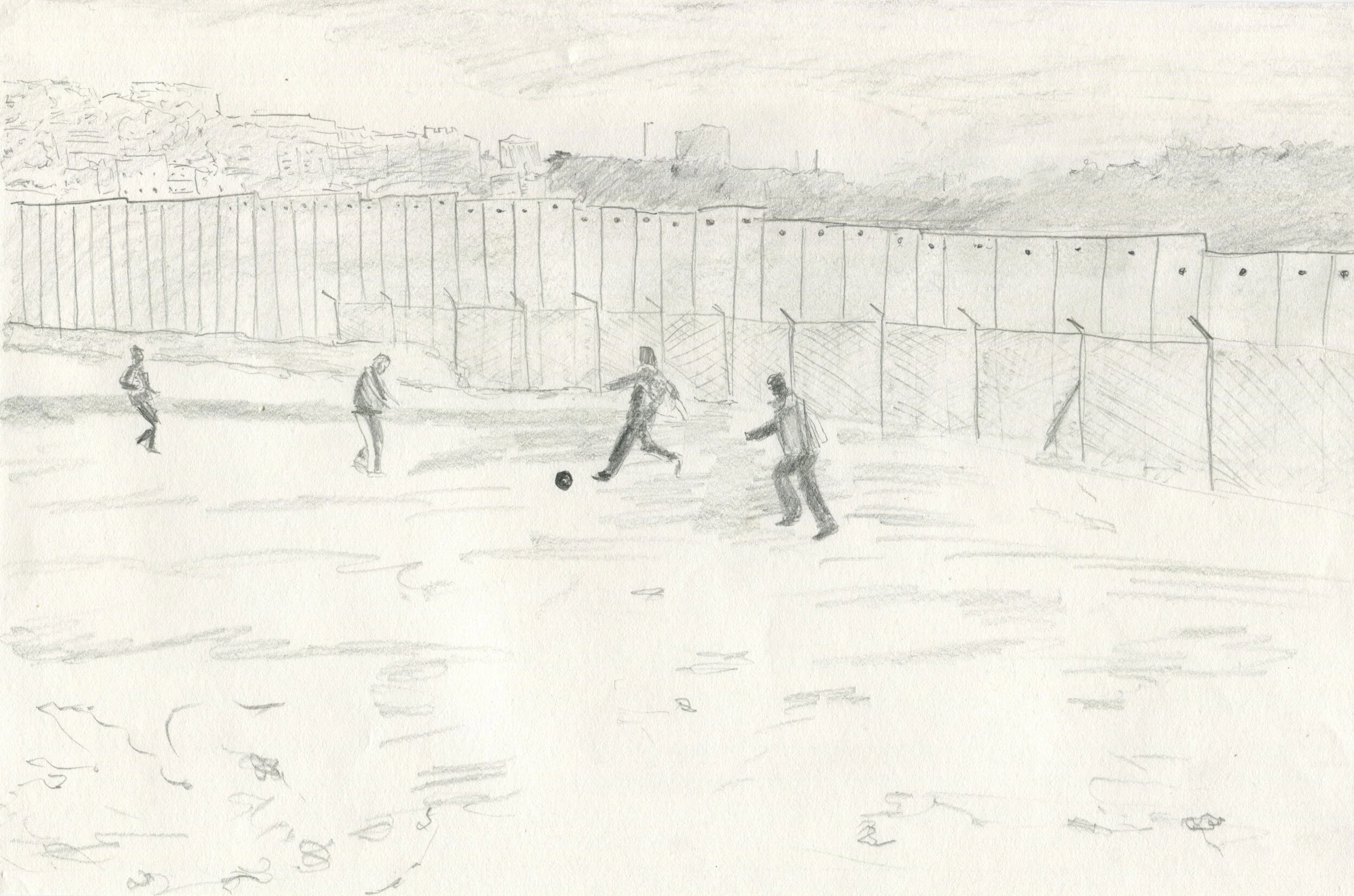
With the figures, I wanted to reintroduce some human element that feels missing from the architecture. I feel like so many pictures we see are of the wall, or of long lines of people choking through a checkpoint or border crossing, so I wanted to introduce some drawings in there that could show people interacting with it in some unexpected ways. Some of them show people building sections of the wall. Drawing 46 shows some kids playing soccer next to the wall in Palestine, and it really does butt up against life that way, the architecture imposing itself on top of people’s daily lives. And of course the scale, too. I wanted to show the scale of the people versus the massiveness of the architecture.
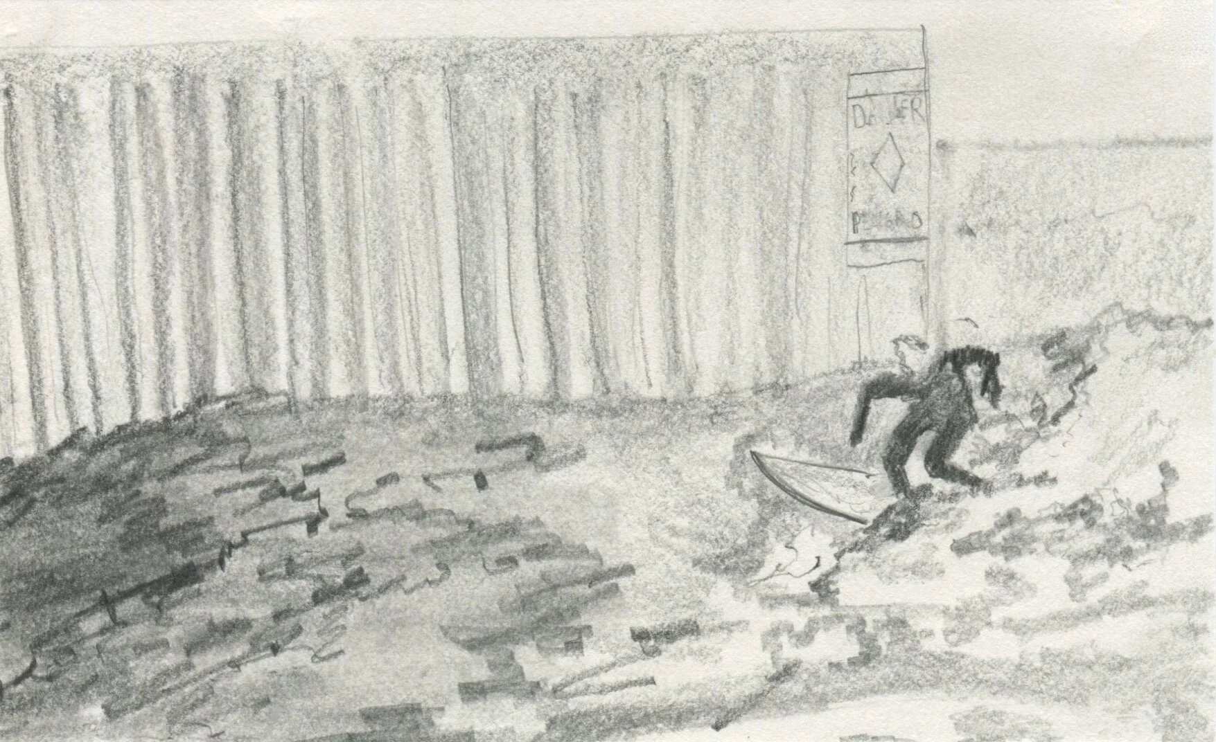
Drawing 12, (it’s not very big) has this person surfing on the American side of the border wall where San Diego and Tijuana meet at the beach. I love that because it shows how truly arbitrary this border really is, when you compare it to this natural border of land and sea… right? The Pacific Ocean!
Drawing 43 shows a moment where Palestinians cut through the section of the separation wall (that’s really more of a fence at that spot). They cut through as a form of protest, something that happens not infrequently.
Or Drawing 35, that’s some boots and a close up on some of those tire popping strips, which I like because it’s a scale inversion, you know? Like, we’re looking down at it as if it is some big wall sloping across our path, but it’s really a few inches wide, which you can see because there’s these big chunky army boots in the frame.
Clockwise from top left: #12, #18, #43, #40, #34, #35 (Click to Enlarge)
The massiveness definitely comes across in relation to the humans— the cars are so tiny! And the feeling of the structures interrupting the ecology and daily lives of people in the spaces they cut apart.
When you think about the similarity of the two border zones (US-Mexico or Israel-Palestine), what significance does it have for you now? Is it the same as when you originally made the piece? (In terms of big ideas- like Loss of placed-ness and destruction of landscape and culture, power of military industry and ideas in that family.)
When I started the project I think I was like “well, there’s a wall here and there’s this other wall over here… and they look the same” but over time I came to realize how much weirder, and complicated it is, especially when you have all these officials in both realms talking about the US-Mexico border as a “laboratory,” which I think really speaks to how they view it.
That was something I think I wanted to try to get at with the drawings, connecting the two landscapes together, and mixing them so it was hard to tell what was what - they do look so similar, the scrubby desert, rolling hills and small trees.
I wanted to further blur the line, as it were, and make it that much harder to figure out, so that somebody looking at the drawings would really have to spend some time with it if they wanted to figure out what was what. Lately I keep thinking about how the border has become both this talking point slash symbol of separation (“BUILD THE WALL!”), as well as an invisible and dispersed concept. Which we can see in ICE raids further away from what we consider border cities, or even in all those videos of xenophobic white people shouting at people for speaking any language besides English.
It is interesting to think what is represented, and what we talk about when we say “the wall” or whatever, is just such a small piece of the whole “border apparatus” that is diffused throughout the entire geographic region called the U.S. and maybe beyond it, too-- and how much hype there was about the wall with Mexico in 2018, at the time you were making this piece.
I am very compelled by the idea of the borders being connected financially to the point of being one disjointed entity.
I’m trying to remember the name of this piece by Hito Steyerl I saw at Artist Space in NY, probably 5 years ago? I think she made it into a book, too. Ok I just googled it. It’s called Duty Free Art.
Oh I have the book! It’s hard.
Yeah, she’s really dense and everything in her writing is so interconnected. Her piece was essentially all these sandbags and TVs, and on the TVs she is charting how all these big art institutions (the Louvre, the British Museum) and big name architects (Rem Koolhaas) are complicit in working with the Assad Regime in Syria. The video she made was this very methodical, but also labyrinthine approach to untangling the messy financial connections between the arts and architecture and state power. I feel like that must have been in the back of my mind when I was making my drawings.
I think that connects back to what you were saying about all these border zones being connected if not by land, then by the sources of funding and the ideologies behind the architectures being built on them.
Totally- like all these things thought of as being separate entities turn out to be different arms of the same squid. Classic horror movie shit.
Arms in everything, black sludge everywhere.
To go back to 17– I’m thinking just aesthetically/poetically about the contrast between this one and 18, where the x’s, on the horizon, interrupts the landscape on the other axis. I’m noticing in the gallery, the drawings were set up in a line, like a film reel or like a panorama, with images from the two places flowing into each other both atmospherically and in succession. the drawings were placed so they were touching, even when it meant having to wrap around a corner wall in the gallery, which I think really contributes to viewers experiencing how similar both places look. It feels a little academic to do so, but I’m wondering how the drawings will change presented in a different format.
When I originally made the drawings, I had no real plan for presenting them… it wasn’t until later that I thought about wrapping them across and around the walls. I think an ideal presentation might be all the drawings in a smaller room. Then I could put them up in a single line around the room, full 360. It always depends on the space… I like to tinker with where things go… like “oh this space has a really funky windowsill, definitely will want to put something there…” you know? Given that this piece is all about architecture, I have to really consider the space that it lives in. Ideally, to make the viewer start questioning their own relationship to space, to architecture. The idea of the white box art gallery, of a neutral space, is made up. Of course there’s no such thing.
I like that you show us the structures as they are being made. Or, made and remade continually, because that seems to be part of it?
Yeah, the building and rebuilding of it all. I remember reading an article in the Intercept, where they spoke with the senior director of Customs and Border Protection at Elbit Systems of America. He’s so matter of fact about their goals for expansion. “Over time, we’ll expand not only to the northern border, but to the ports and harbors across the country, [...] There’s a lot to be done.”
Maybe it’s partially because trauma is hard-wired into the consciousness of Jews in America...It’s hard for me to see a quote like that and not think of the ever-expanding police arsenals in the U.S., the drones over protests, unmarked Federal Agents in Portland, ICE raids in Chicago. Different arms of the same squid.
***
Resources:
Why Is Anti-Semitism Still Present In America?
Border Patrol Is Using “Virtual Wall” Technology Israel Uses in Palestine
Border Patrol, Israel's Elbit Put Reservation Under Surveillance


